Trendy Paint Colours and How to Use Them
It is, in a way, an obligation to follow the most fashionable pulse in the world of interior design: colour trends of paint. This year, a lot of colours enter the palette, promising to have the power to transform any environment from the ordinary to the glossy-magazine-worthy. From comforting sage greens to the bold statement of aubergine, these chic colours assure that the spaces they find themselves in will be anything but standard.
Applying these colours is still not about picking up a paintbrush and saying a prayer; it requires subtlety in knowing exactly how colour influences space, mood, and style.
The Zen of Sage Green
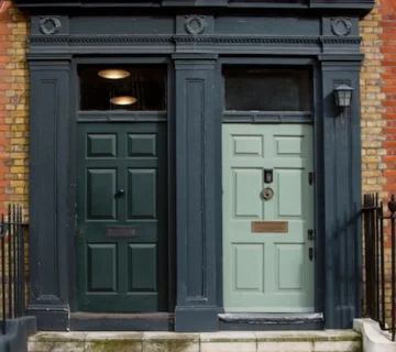
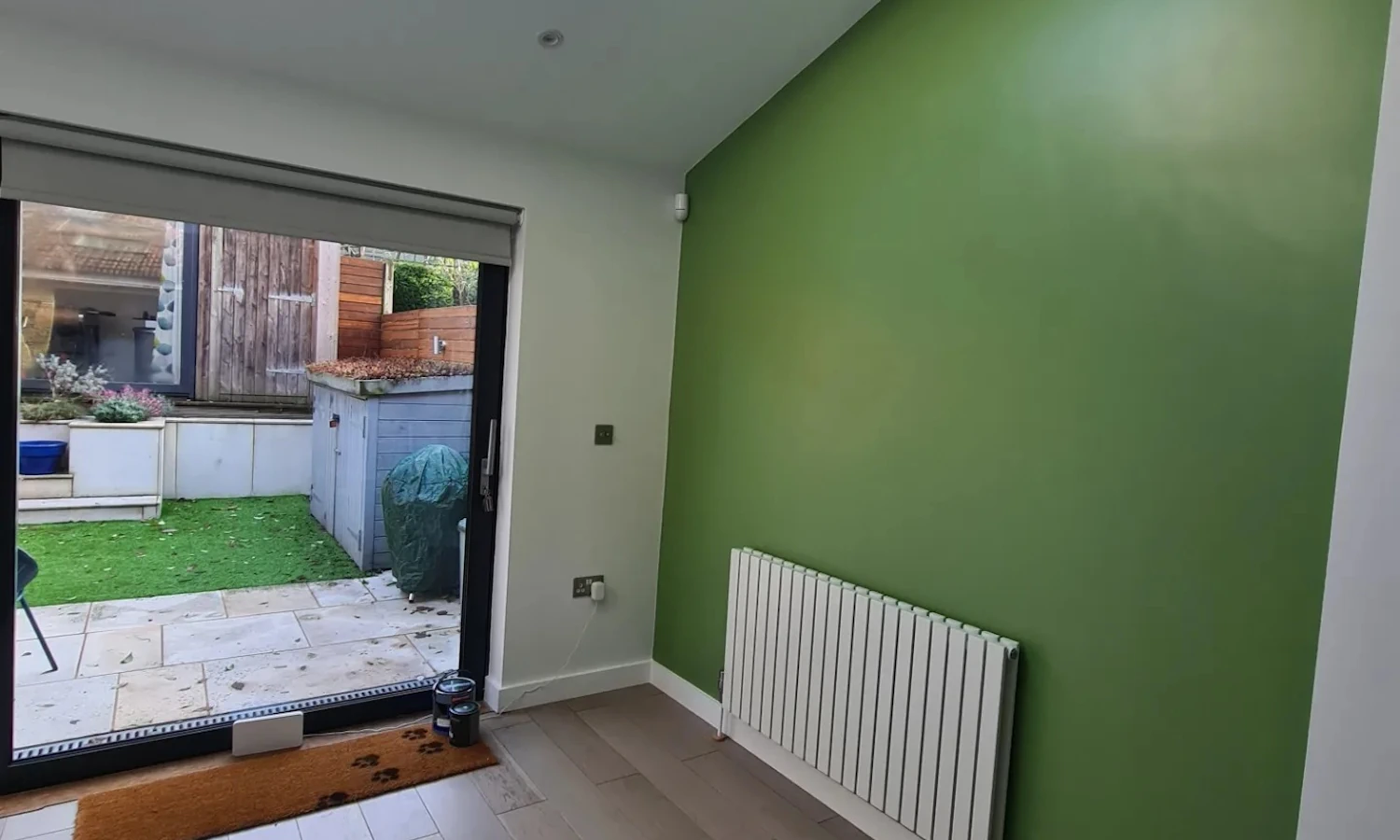
That is sage green—a soft, muted greyish-green—that has taken impact on interior design by offering a quieter backdrop and room for the natural material, from wood to stone to leather. This is the true power behind this shade, as it’s versatile enough to produce a tranquil space in bedrooms and bathrooms or give off a clean feel in living areas and even kitchens. This calming shade is perfect when paired with soft white tones or pale, chalky greys against a lot of woody tones to get a space that speaks of relaxation and calm. Aubergine Ambitions: A
Plunge into the Deep
In the scale, the other aubergine is at one end and is plush and gives a rich, decadent background. This bold colour, with its deep shades of purples, can turn a room into a statement piece. The thing about aubergine is that it has to be just right to balance out its intensity. The colours would be combined with light ones, like aubergine with soft grey or dusky pink, so as not to assault the eyes.
Aubergine can make dining rooms cosy, and bedrooms luxurious—all wrapped in its warm embrace.
Sunshine Yellow
For people whose home colours need to be filled with energy and positivity, sunshine yellow would be their colour. This bright tone of yellow gives plenty of pop in kitchens or any other rooms that need a little “pick-me-up. To avoid visual overwhelm, bring sunshine yellow in through accents and accessories or as a feature wall balanced by neutrals that let it shine without it taking over.
The Elegance of Earth Tones
Nature’s neutral, earthy tones, are making a huge comeback this year and are bringing the great outdoors back. With warm, grounding shades of terracotta to ochre, they evoke the outdoors in a space that feels posh yet homey at the same time. The key to earth tones is in the layering of different shades within one palette to provide a rich dimension that is sophisticated, yet inviting.
Navigating the Neutrals
While bold colours take the spotlight, neutrals remain unsung heroes of the colour world—a canvas that allows for building your interior dreams. The greige colour has moved on from the icy white palette and became the new sophistication in many spaces.
Neutrals offer endless versatility, acting as a foundation for any design scheme, whether minimalist or maximalist.
In Conclusion
From its conception through to the present day, the dynamic world of interiors respects and embraces the latest colour trends to be able to portray your home as one of contemporary elegance. But the real magic is not following these trends to the T; it lies in adapting them to your style and space. From the peacefulness of sage green to the powerful depth of aubergine, from the cheerfulness of sunshine yellow to the rich tapestry of earth tones or the subtlety of the natural palette, these are the new emerging trendy colours that offer full expression to your vision. Balancing these colours with well-chosen design accents will create spaces not just on-trend but timeless, lasting longer than the trend of the moment. Remember, colour is not just an optical experience but an emotional one that provides a canvas to paint, not your walls, but your very life in the kaleidoscope of interior design.