Best Colours to Boost Home Value for Resale
The right paint colours can help a house sell faster and for more. Buyers want a home that looks clean, modern, and easy to imagine themselves living in. Loud colours distract. Dated tones age a room. Choosing the correct shades makes a strong first impression and adds perceived value.
Go Neutral, But Not Cold
Warm neutrals consistently perform best. Soft greys, off-whites, greige, and warm beige tones appeal to the audience. These colours feel clean and modern without being clinical.
Avoid stark white. It can feel cold and highlight imperfections. Go for soft ivory or creamy white on walls. Pair with crisp white trim for contrast. It works well in older homes, giving them a fresh but timeless look.
Dulux ‘Egyptian Cotton’, Crown’s ‘Soft Mocha’, and Farrow & Ball’s ‘Skimming Stone’ are popular choices that buyers love. These tones create calm, elegant spaces that suit any style of furniture.
Kitchen: Keep It Light and Clean
Kitchens must look spotless. Light greys, pale blues, and muted greens help create that effect. Stay away from dark or trendy colours—buyers worry about having to repaint.
Sage green works well on kitchen cabinets, especially when paired with brushed brass handles and light stone worktops. For walls, stick with soft grey or chalky white. Avoid anything too warm in the kitchen—it can clash with appliances or tile.
A neutral backdrop gives the room more versatility and suggests an easy-to-maintain space. It adds appeal, especially for buyers comparing multiple homes in a similar price range.
Bathrooms: Crisp, Spa-Like Tones
A bathroom should feel clean, fresh, and modern. Paint it anything too dark or bold, and it can feel small or outdated.
Stick to cool neutrals—soft blue-greys, chalk whites, or light pebble tones. They reflect light and give a spa-like finish. Combine with white tiles, mirrors, and chrome fixtures.
Paint ceilings a shade lighter than the walls for extra height. Use mould-resistant paint for durability. A well-painted, neutral bathroom tells buyers the home has been looked after.
Living Room: Inviting and Flexible
The living room needs warmth and flexibility. Taupe, beige, and earthy beige strike the right balance. These colours complement any furniture and make the room feel move-in ready.
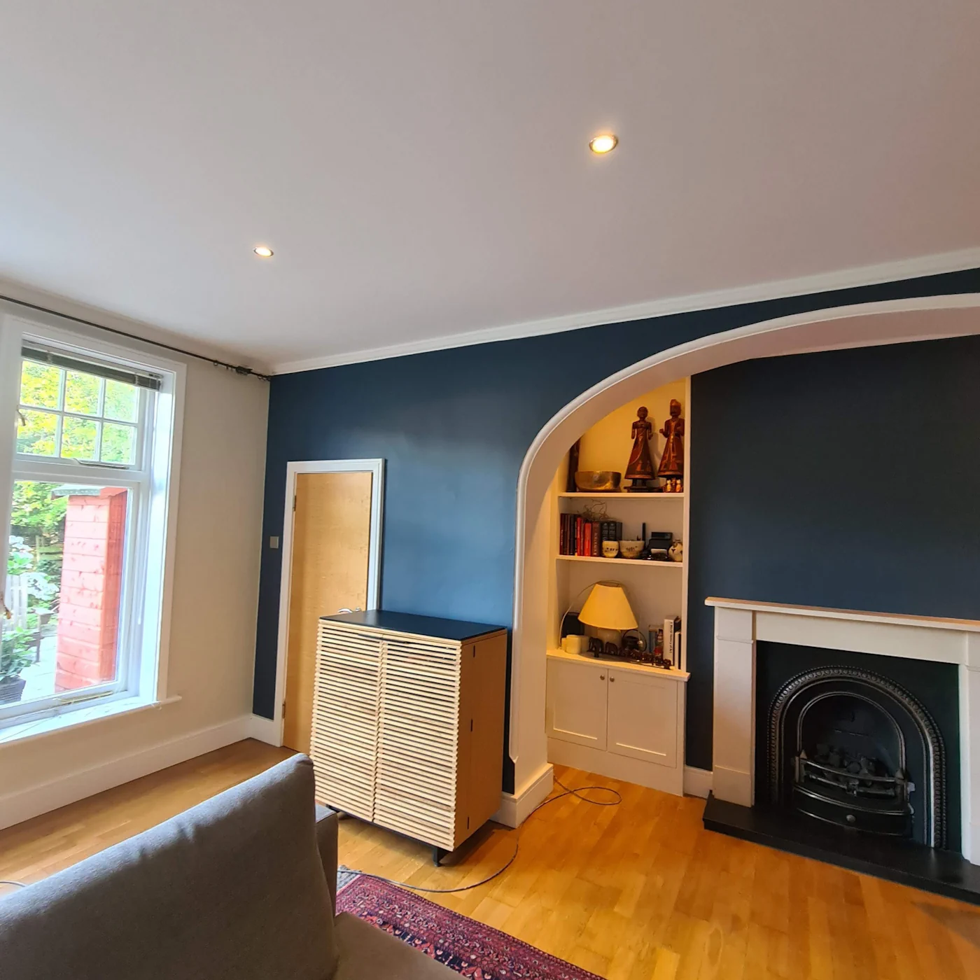
Avoid anything too bold, like dark red or navy. These can make the space feel smaller and limit a buyer’s imagination. Neutral tones add to the room’s breathing space and show off natural light.
Try Little Greene’s ‘Clay Mid’ or Johnstone’s ‘Velvet Truffle’. They bring warmth without overwhelming the room.
Bedrooms: Calm, Restful Colours
Buyers look for tranquillity in a bedroom. Stick with soft lavender, light blue-grey, or pale sage. These colours feel restful and fresh, perfect for a master or guest room.
Avoid bright or clashing feature walls. If you want a feature, use a shade one or two steps darker than the rest of the room. Subtle contrast adds depth without distracting.
Dulux ‘Polished Pebble’, Valspar ‘Stillness’, and Farrow & Ball ‘Ammonite’ are good bets.
Exterior: First Impressions Count
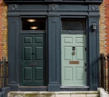
Kerb appeal sells. A tired or dated exterior puts buyers off before they walk in. For the front door, go classic. Navy, deep green, or charcoal grey feel sophisticated and solid. Avoid bright colours.
For exterior walls, use off-white, pale grey, or stone tones. These help the house stand out without looking garish. Match with the surrounding homes—buyers don’t want to repaint just to fit in.
Final Word
Buyers don’t want to paint as soon as they move in. The right colours suggest your home is well cared for and move-in ready. Stick to warm, neutral, light shades. Avoid bold trends. Use paint to highlight space, light, and cleanliness. That’s what sells.